Animation Mentor AN01 - Week 03
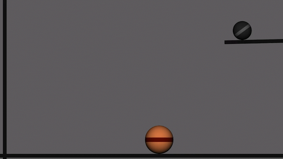
This week the assignment doubled down on planning and blocking techniques with the task of showing “weight” through timing and spacing. Again the medium would be the bouncing ball, but with the complication of adding TWO balls in the same shot. One heavy and the other light.
In my motion design work, I always start with a sentence describing what I’m going to create, so I started there…

I don’t own a beach ball, so I went onto YouTube to find some reference video, and combined several videos in DaVinci Resolve to “Frankenstein” something that looked like what I wanted to do…

Then I sketched out the blocking for the animation to figure out when things would be happening…

Then I went into Maya to animate the scene. Once I started to put it together, I realized that the reference video I put together was way to complicated. The Beach ball was doing way too many changes of direction. A real beach ball would lose its energy and come to a stop after just a couple of bounces, so I scrapped my reference and did what looked right. It wasn’t part of the assignment, but I couldn’t resist adding in a bit of camera shake to emphasize the weight of the heavy ball…
A big part of each week going forward is responding to the feedback on the previous week’s assignment, and doing some revisions to show improvement. Tim Ingersoll, the instructor, liked what I had done, but felt it was too realistic and a bit sterile and wanted to see me push and stylize the animation a bit more.
He gave me some important insight in his video critique… The perceived weight of a character can really be influenced by exaggerating the spacing on “the downs”. Meaning that the feel of the ball on its way back to the ground would determine the personality of the animation.
With that I went back into Maya and tweaked my curves without changing any of the key frames. The curves in the graph editor determine what happens in between the key frames. This is the “spacing” of the animation. To help visualize this I overlayed the old and new curves in photoshop to show the difference…


In this image the new curves are bright green and have a distinct “lean” to the right. The curves look more cartoony and resulted in a much more cartoony feel to the bouncing ball. The difference is subtle but good animation is all about the subtleties.

Original bouncing ball. Looks quite realistic!

New more cartoony bounce…